COLOR MATCHING: How to GET THE MOST ACCURATE COLORS
Color Accuracy of your artwork is a top priority to us due to it’s complexity. All colors must be chosen or agreed upon by you, the client, before an order can be approved. Here’s our top ways of how to best get your artwork colors ready for print.
There are a lot of factors that come into play when trying to best accurately color match your requested color. The way we view colors varies greatly depending on the environment we are looking at. Screen Colors vs Ink Colors, RGB vs CMYK, Color Opacities, Fabric Type, Ink Type, Natural Light vs Artificial Light, Pantone Matching, Ink Drying, Humidity, and more all play a role in how we see color.
1. Pantone Matching
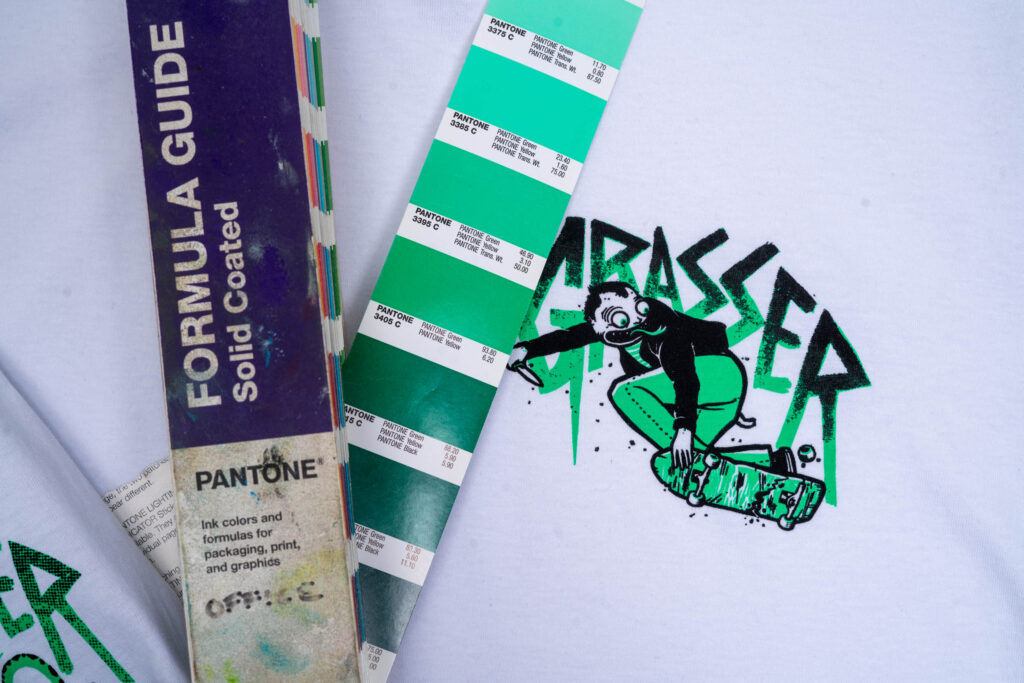
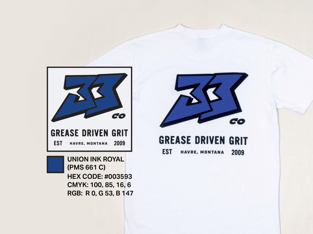
The PANTONE Matching System is the standard color-matching system for printing. The #1 way to get your artwork accurately printed is to provide a specific Pantone Color Matching Code for each color in your artwork. We can use these codes to order a specific color-matched ink to be used on your garmets, this is especially helpful for make sure multiple orders all match.
We use SOLID COATED PANTONE COLOR CODES
IMPORTANT: There is normally a 5-10% tonal difference between color appearance On-Screen vs Physical Print
Fabric Color, Fabric Type, Print Underlays, and Print Requests are all factors that contribute to this 5-10% difference.
$50 Pantone Color Matching Fee
2. SPECIFIC COLOR WITH DIGITAL oR PHYSICAL PROOF
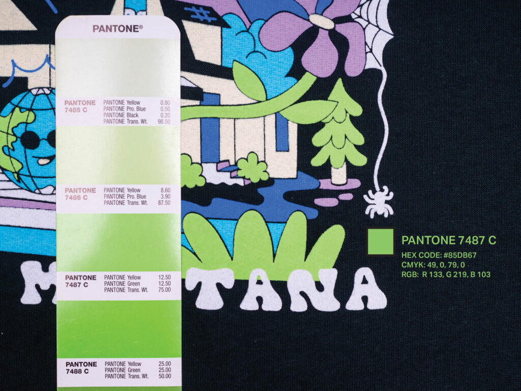
If you don’t have a PANTONE Color Code the next best option for accurate color matching is to provide a physical or digital representation of your color choices. Even specific well known colors are extremely useful, such as “Yamaha Blue”, “Honda Red”, “Bobcat Yellow”, or “Kawasaki Green”. The more specific with color request the more likely we can nail it. CMYK or RGB codes are a great start but will have a 5%-30% tonality difference in on-screen versus printed ink appearance.
RGB or CMYK Hex Codes, Physical & Digital Proofs
Color requests provided in this fashion will have between a 5%-30% Tonal Variance in On-Screen vs Physical Print.
The ONLY 2 Colors you can call out by name are White and Black, everything else is up to interpretation. Every color has an infinite amount of shades, tones, and options to choose from. The more specific your color request the closer we will be able to match your art. Generic color requests will be as closely matched to one of our stock colors. Colors will need to be finalized for an order to run through the approval process.
Generic Color Request such at “Yellow or Blueish/Green” will be matched as closely with a stock color as possible.
5-35% Tonal Variance
$75 covers prepping your art for screen printing and 1 mockup.
Multiple color change requests will add additional Design Fees before print and also a Change Order Fee if sent to print.
DESIGN ASSETS
Need help picking colors? Here’s digital versions of both a PANTONE Solid Coated Color Book and a Union Ink color card of the stock plastisol inks we always keep on hand. Use these to pick specific colors that match your artwork so we can get your orders turned around asap.